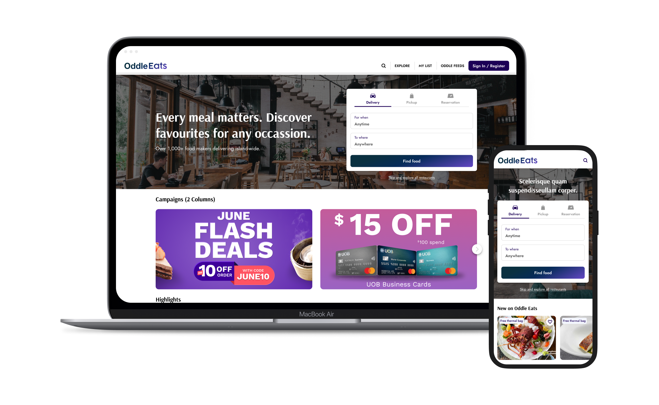
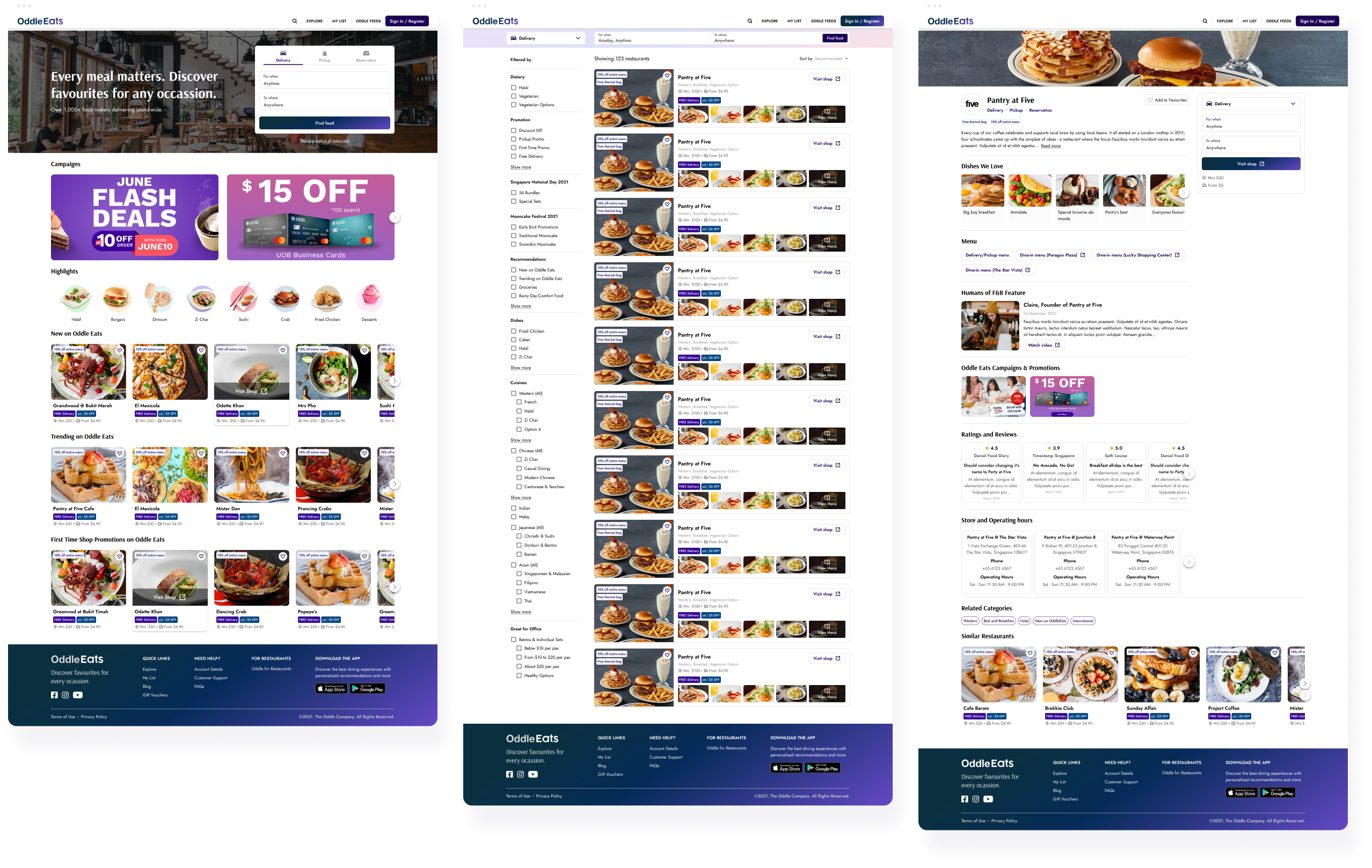
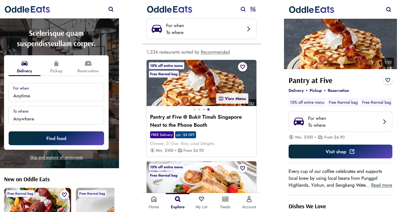
OddleEats (B2C)
Search and Discovery Experience
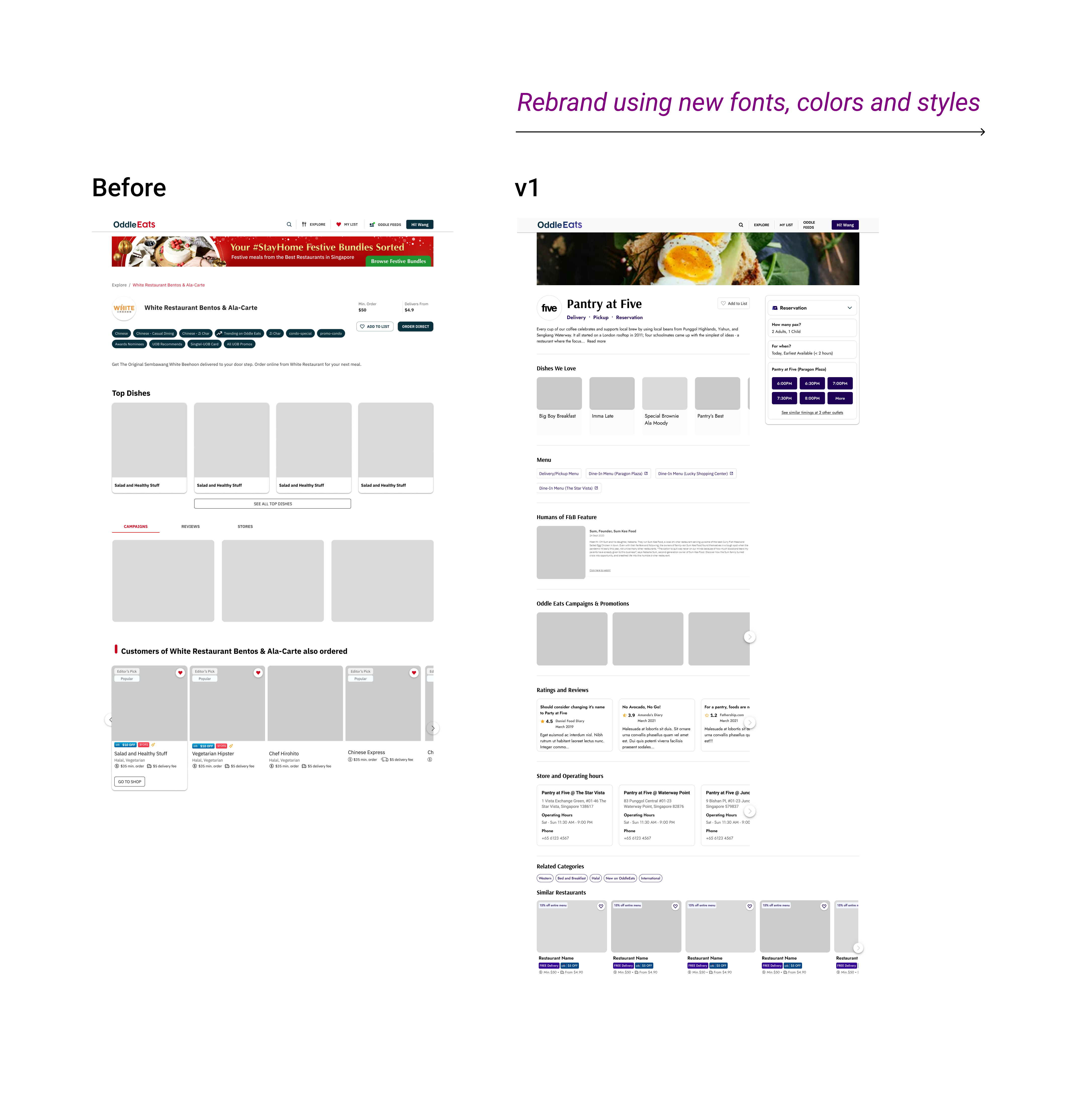
Platform
Mobile/Desktop Responsive Website
Timeline
v1.0: Mar - Jun 2021 (4 months)
v2.0: Aug - Oct 2021 (3 months)
v2.0: Aug - Oct 2021 (3 months)
Status
Launched
View current live site ↗Team
1x Designer
1x Product Manager
5x Developers
1x Product Manager
5x Developers
Role
- Collaborated with product manager and engineers on UI redesign of OddleEats experience